Westbridge
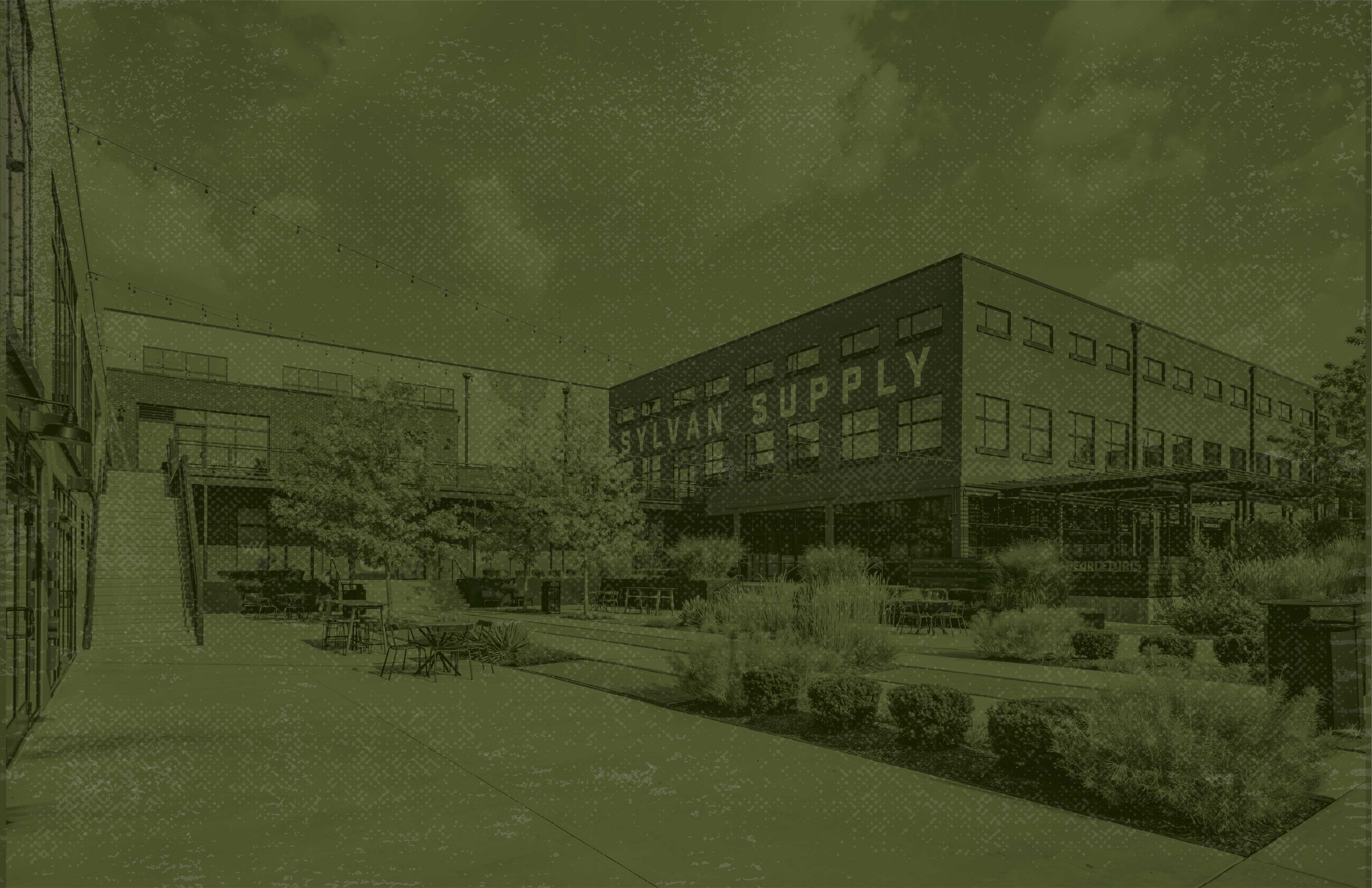
Westbridge, the real estate development company behind much of ATL and Nashville’s urban redevelopment scene, approached Nimble. Design Co. in search of a new brand identity that felt honest to the historic buildings they help bring to life daily. With truly well done adaptive reuse lining their portfolio — Westside Paper, Sylvan Supply, and Westside Provisions — we chose to let their portfolio take center stage when concepting this brand, with an honest, “let the work speak for itself” mentality. Our color palette was entirely drawn from the material tones of their past projects, contrasted with an earthy green to signify the growth and visionary reuse that draws back to Westbridge’s core tenet. The logo itself was derived from the criss-crossing steel of the Westside Provisions bridge in West Midtown, Atlanta, making for a signature mark that pays homage to Westbridge’s past, while paving their way into their future portfolio.
Design work shared is the sole property of Nimble. Design Co. and its respective client with granted permission to use for portfolio purposes only.
Project type
Branding
Client Name
Westbridge for Nimble. Design Co.
Creative Direction
Candice Riley Campbell
Design Team
Alyshia M. Bradshaw
Copywriting
Maria Royal
Project Direction
Lauren Riedling


